Brand Identity • Website Design • client experience • print design • images
Caitlin O’Bryant Design
Every business relies on their branding (visual and beyond) to communicate their story and values to the world. But, I don’t think it’s a stretch to say that creative businesses rely on their brand and brand voice even more.
So when I set out to create the visual language for my wedding stationery business, I focused on designing pieces that reflected what I stood for, who I was , and who I wanted to be.
Deliverables:
Primary Logo
Submark
Color Palette
Typography Palette
Squarespace 7.0 Website
Dubsado Forms
Lead Magnet Design
Client Work (Stationery Design)
Brand Flat Lay Photography
brand identity & vibe
I wanted a brand that felt timeless and classic, and allowed for the work itself to stand out.
Weddings can have so many different kinds of personalities, and I knew that as long as they were design-forward and had an elevated style about them, those were the ones I wanted to work on. So it was really important that I created a brand that captured my values, but ultimately let the work and the photography be the statement piece. I ultimately chose a simple hand-written serif logo, and neutral tones.
logo design
I created a texture in Procreate and used it as an image mask to add delicacy and movement.
The movement of light and dark and subtle texture in the logo made it reminiscent of printmaking—something that felt very appropriate for a stationery company. I wanted to to feel organic and timeless.
I also made standard, vectorized versions of the logos for other brand needs.
typography
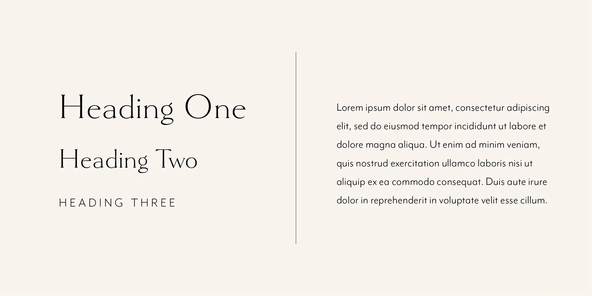
Type was chosen for a combination of readability and polished character.
I wanted something that had a human feel, but was still clean and minimal.
For larger headers, Goldenbook Light was perfect! The minimal serifs and character balance was just the right touch of “human.” I particularly love the two-story lowercase g’s. And Mr. Eaves is one of my favorite choices for clean body text. It’s super readable, but doesn't feel overused or calculated. Just the right balance of practicality and character.
Website design
My goal was to create an effortlessly memorable site that highlighted the photography and copywriting.
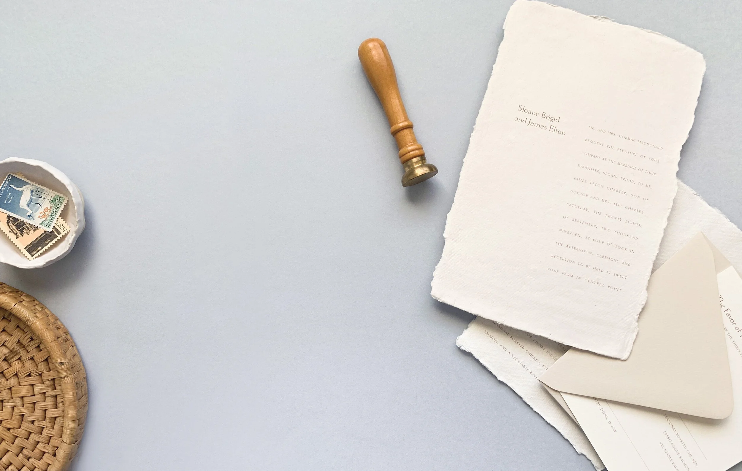
I was so fortunate to partner with incredible photographers over the years who captured my work and the weddings in stunning ways. I also loved styling and taking my own photos of my work.
Because the work was so visual, it was really important to me that that was the star of the show. Copywriting was a lovely supporting act, and backed up the first impression beautifully.
Hover to Scroll
client experience
Providing a luxury service meant starting with a luxury client experience.
I considered every detail of the client journey, from initial impressions on the website, to finding useful advice and information on the blog, down to how leads inquire, what the lead funnel looks like, and how they move through the design process with me.
print design
I also created other branded collateral to pair with client work like custom packaging details.
Elevating the client experience also meant that everything in the packaging experience was considered. Custom linen folios to hold copies of their invitations, branded boxes and inserts were created to help add to the experience.
I also included special surprise details in every client shipment, including stationery to write letters to each other for their wedding day and copies of the stationery for photographers and wedding planners to showcase (with fake addresses for privacy).
Client Work
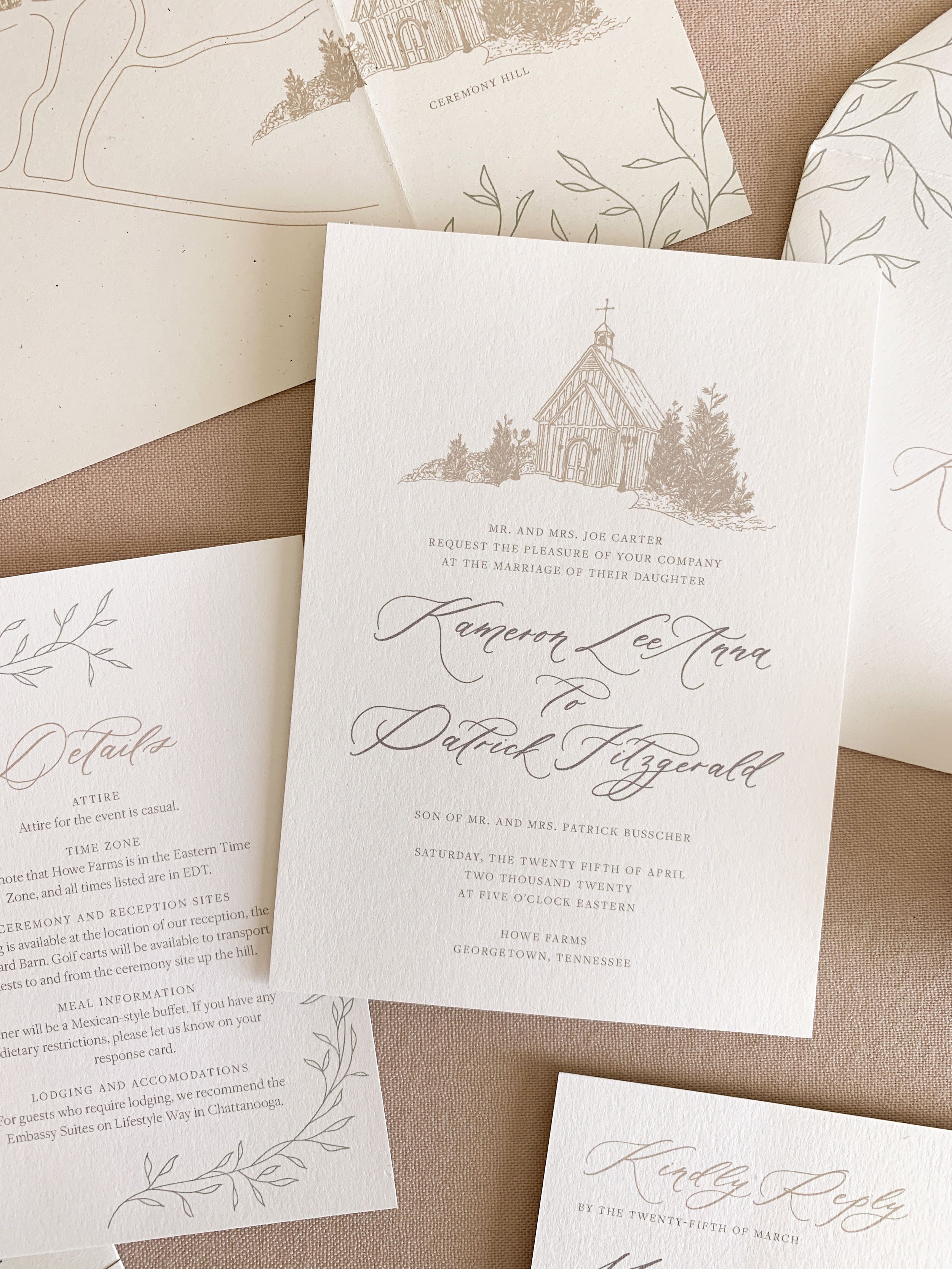
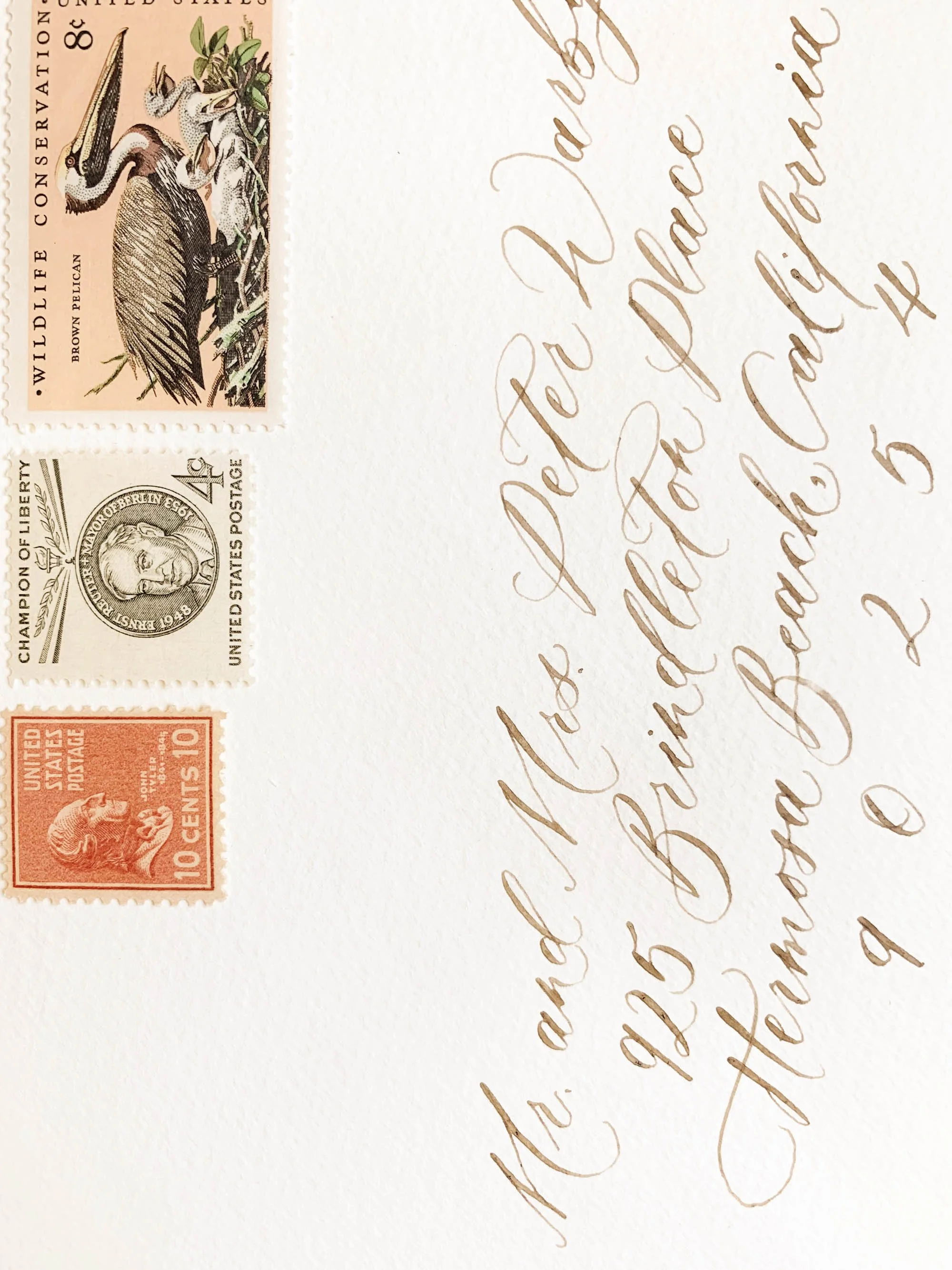
I designed and produced dozens of invitation suites for clients across the world during this time, each featuring special elements like vintage postage, custom illustrations, calligraphy, wax seals, feathers and dried florals, and specialty printing methods like letterpress, embossing, screen printing, and foil.


