brand mark design
Emily Kirsten
I worked with Emily on a handful of photoshoots starting in 2018. She is an incredibly talented photographer and lovely human being. I was so honored when she reached out to me looking for a new logo design for her business—one that reflected the elegance and softness of her wedding and brand photography.
Deliverables:
Primary Logo
Submark
the vibe
From the start, Emily knew she wanted a script logo—something that was polished, but handwritten, and full of movement.
I wanted the lettering to feel light and flowy, just like Emily’s photography style. Her clients were looking for a story in their photos, one that was intimate and soft and captured the sweetness of every moment. When pulling inspiration together, I focused on her own photography paired with old-world, European elements and tried to capture the same feelings.


logo design
I created a family of brand marks that varied in color and texture, so she had the perfect fit for any collateral.
I created a subtle, custom texture in Procreate, then used it as an image mask in various versions of the logo, on top of standard, solid vector graphics.
The icon designs use slightly modified versions of the letters in the primary logo, and are to be used interchangeably depending on the final intended size.


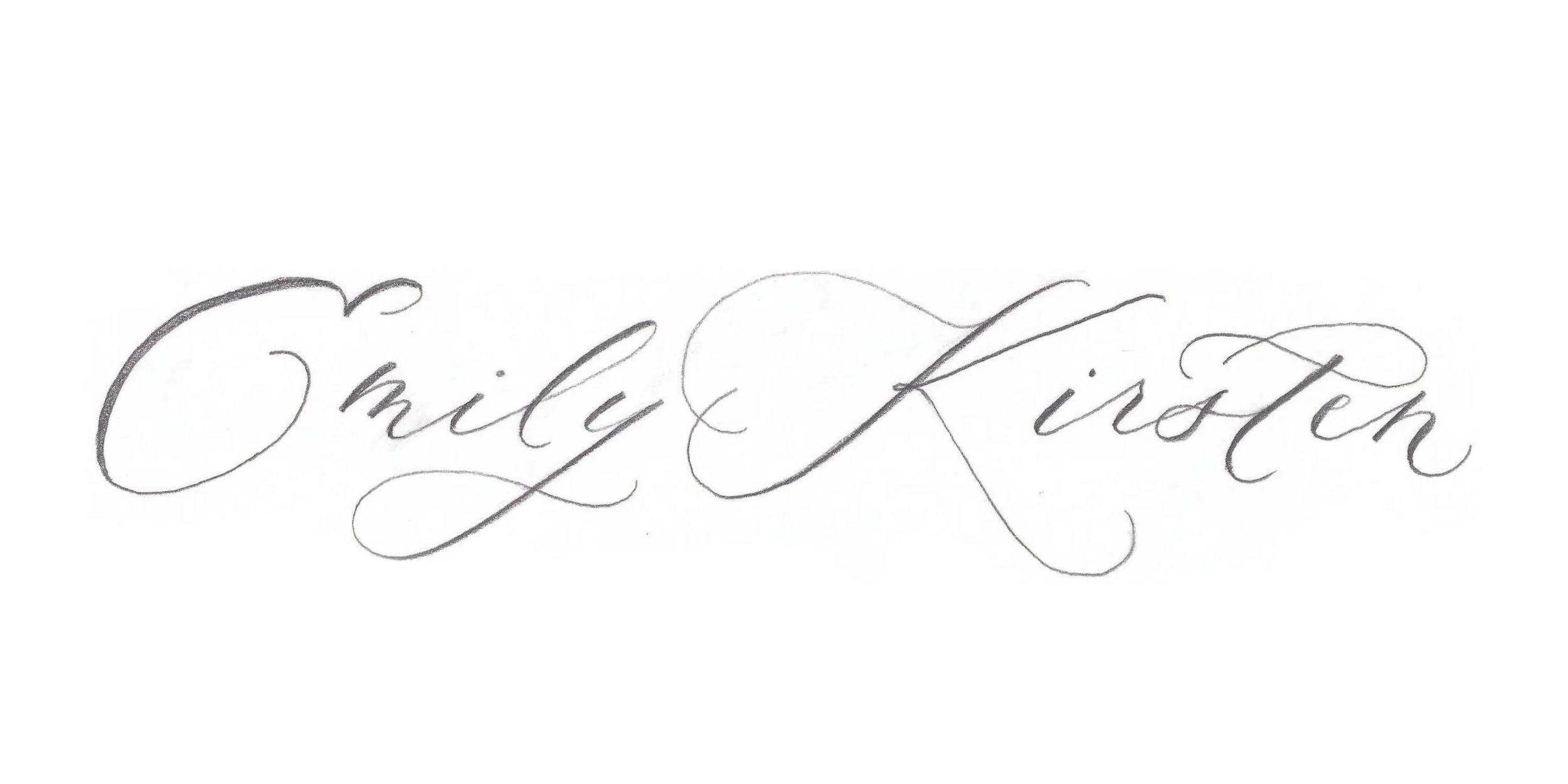
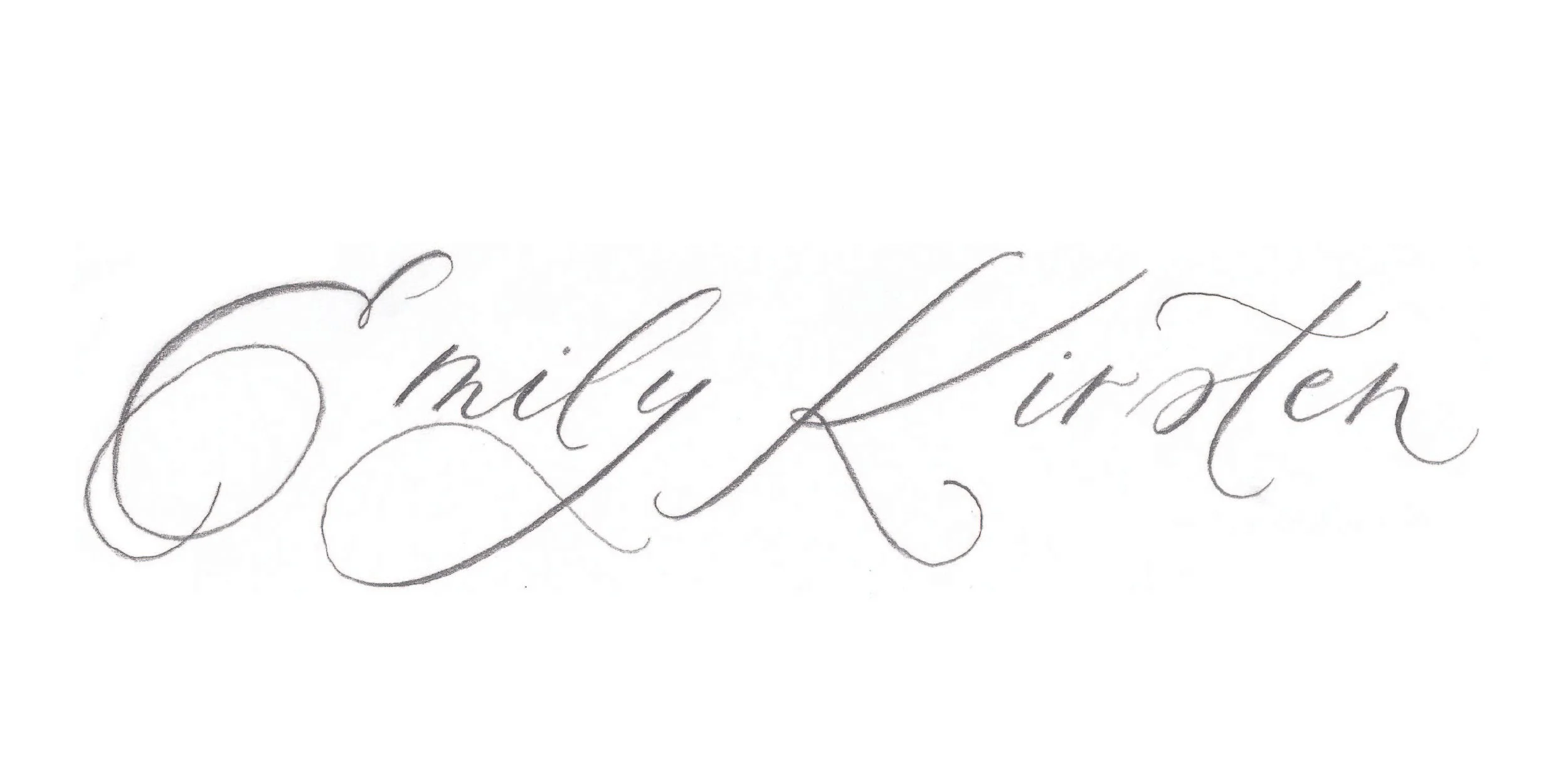
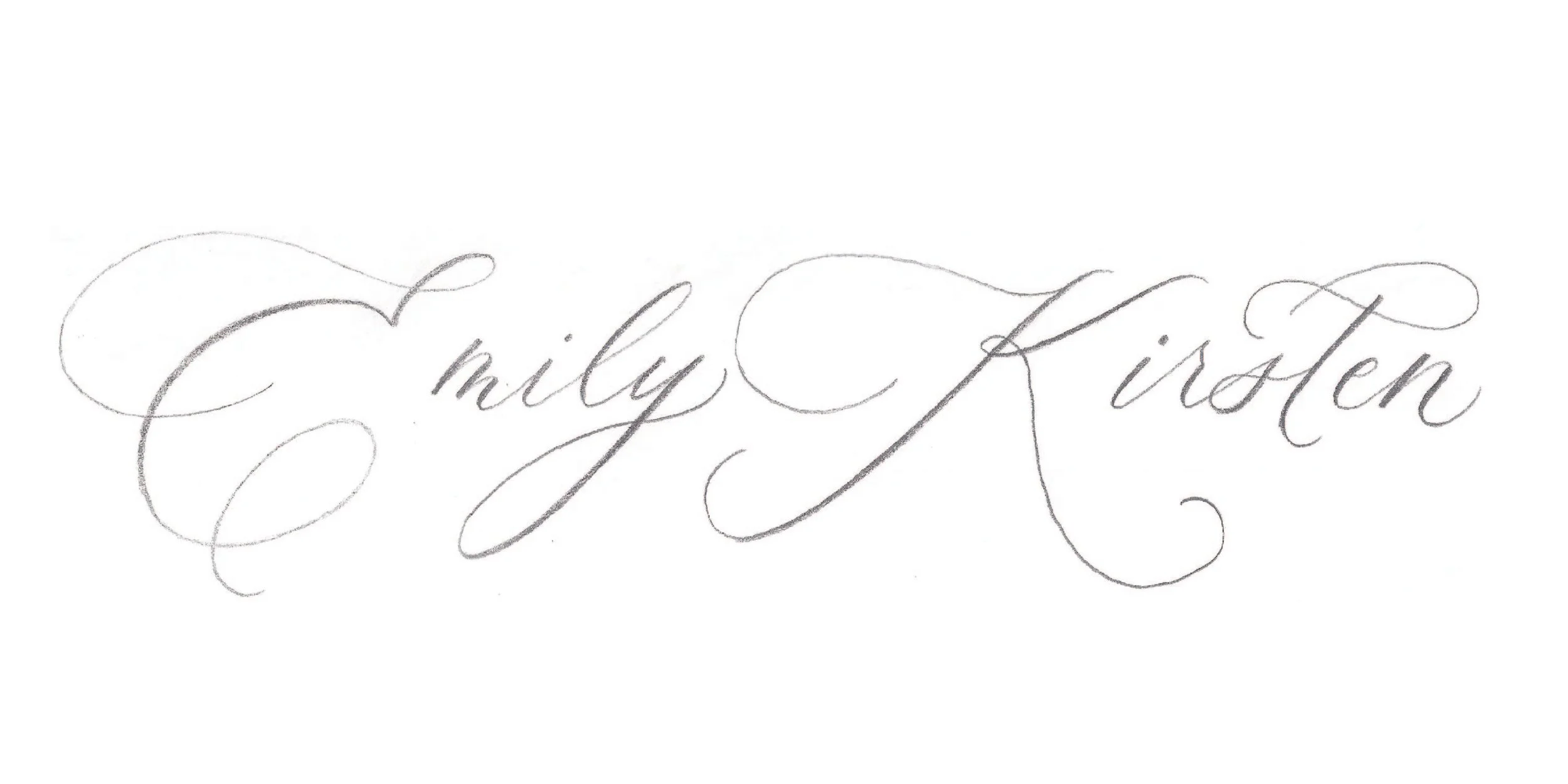
concept exploration
We landed on the final design after exploring a few different options in sketch form.
The easiest brand client I’ve ever had, Emily immediately knew she loved a combination of letters from the first and third options, and I made some quick revisions.