

brand mark design
Mylyn Wood
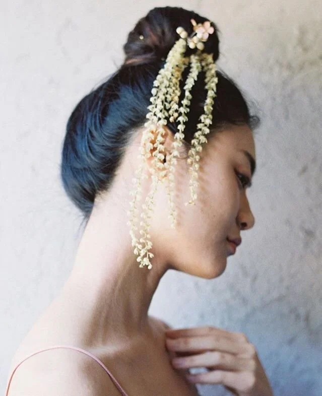
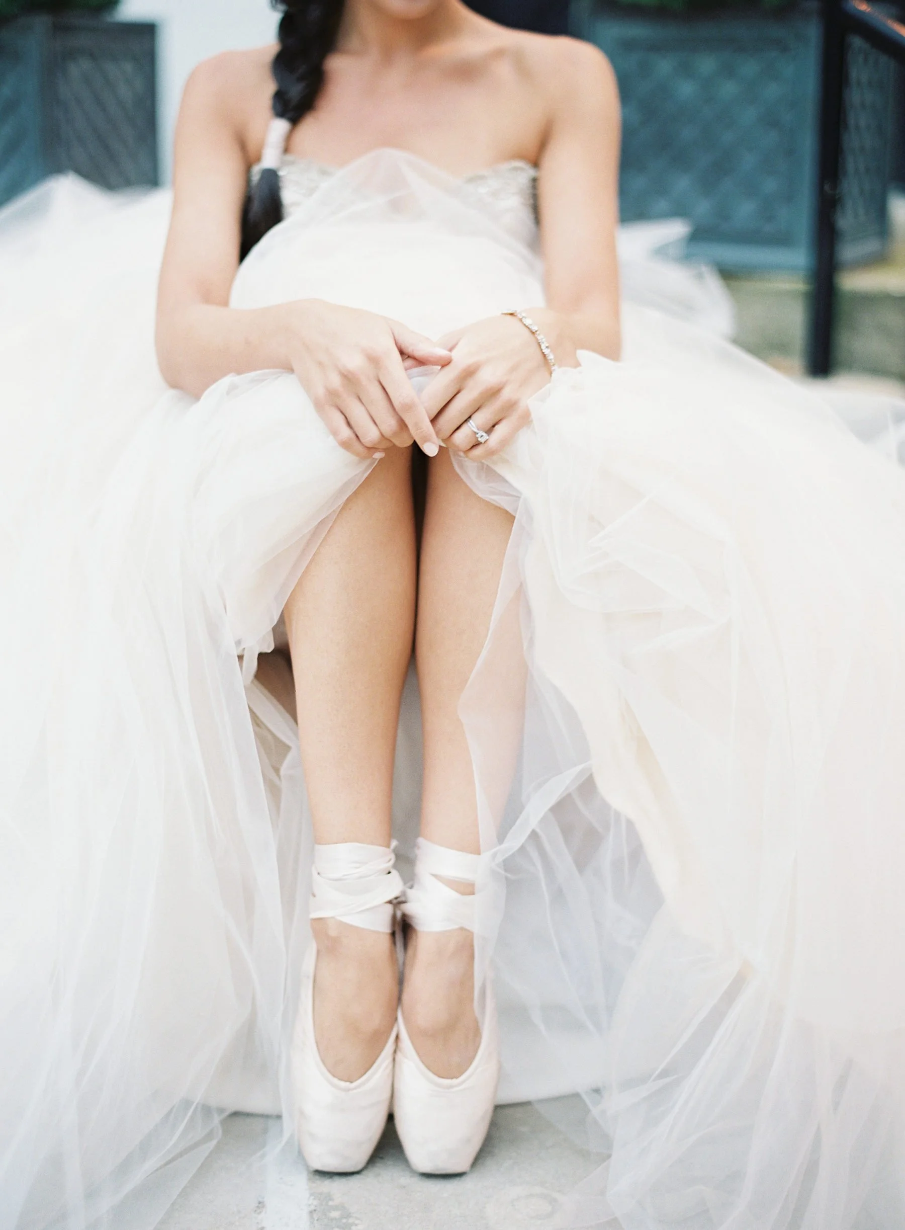
I first worked with Mylyn on a photoshoot in the fall of 2018, and was completely blown away by her work. I absolutely love her approach to photography and her business: genuine care, artful attention, and heirloom quality. These values are so apparent in her work.
She approached me to create brand marks that felt in alignment with the spirit of her photography.
Deliverables:
Primary Logo
Submark
Brand Vector Illustrations
the vibe
Mylyn was craving a brand that reflected her values—something with both strength and elegance, and a few wisps of romance.
I wanted the branding to be timeless: something that had some personality, but could ultimately grow with her through whatever iterations her business would go through in the years to come. I focused on natural textures, classic colors, and light, easy movement.

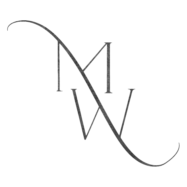
logo design
I created a family of brand marks that varied in color and texture, so she had the perfect fit for any collateral.
I created a subtle, custom texture in Procreate, then used it as an image mask in various versions of the logo, on top of standard, solid vector graphics.
The icon design pulled the flourish from the “n” in the primary logo and integrated it into her initials.

concept exploration
We landed on the final design after exploring dozens of variations in thumbnails.
I wanted to experiment with as many variations as possible in the timeframe to find the perfect solution for her unique name.
Mylyn wanted to pull away from a calligraphy logo, in part because she wanted something that stood out a little more in the photography industry, and also because she wanted something that felt more fluid with the two y’s in her first name.

brand vector illustrations
Mylyn also wanted custom illustrations to pair with brand, specifically for use on her packaging.
As a photographer, she provides USBs, albums, and prints for clients all the time, and wanted something that felt in alignment with her brand and values to print on the packaging materials, without necessarily being her logo. This packaging included things like linen heirloom boxes that could be easily displayed on a table or bookshelf for years.
Pulling inspiration from plants native to Saipan (where she grew up) like sampaguita and ginkgo and traditional Asian printmaking methods like woodblock, I created two options for her to use on various materials moving forward.


